Please click on the link below to view my evaluation:
http://prezi.com/pv_z30ywvlyo/media-evaluation-as/
Monday 25 April 2011
Friday 1 April 2011
Feedback from class.
After gaining some feedback from the class, here is a list of the things that were brought up a couple of times:
- The target audience is females with the ages ranging from 10-25
- The colour scheme is used throughout and show not only the audience but reflects the genre of music focused on.
- The images are relatable and show the 'star' as having a friendly quality to her.
- The mode of address is accurate for my target audience.
- Some of the photos could do with a different colour background or something else to make it more interesting.
- Some of my text could be made bigger so it stands out more and makes it easier to read.
- My front cover is possibly the weakest item.
Overall, the feedback is positive with a few critical things which I could do to improve my work. The target audience was identified correctly which is a good thing as it means that the work is relatable to the right audience, and is shown through the images and the mode of address.


Evaluation ideas.
I have decided that I will either use Prezi or put a PowerPoint onto Scribd for my evaluation as these are the two ways that I feel most comfortable with.
Friday 25 March 2011
Final DPS.
Here is my final DPS:


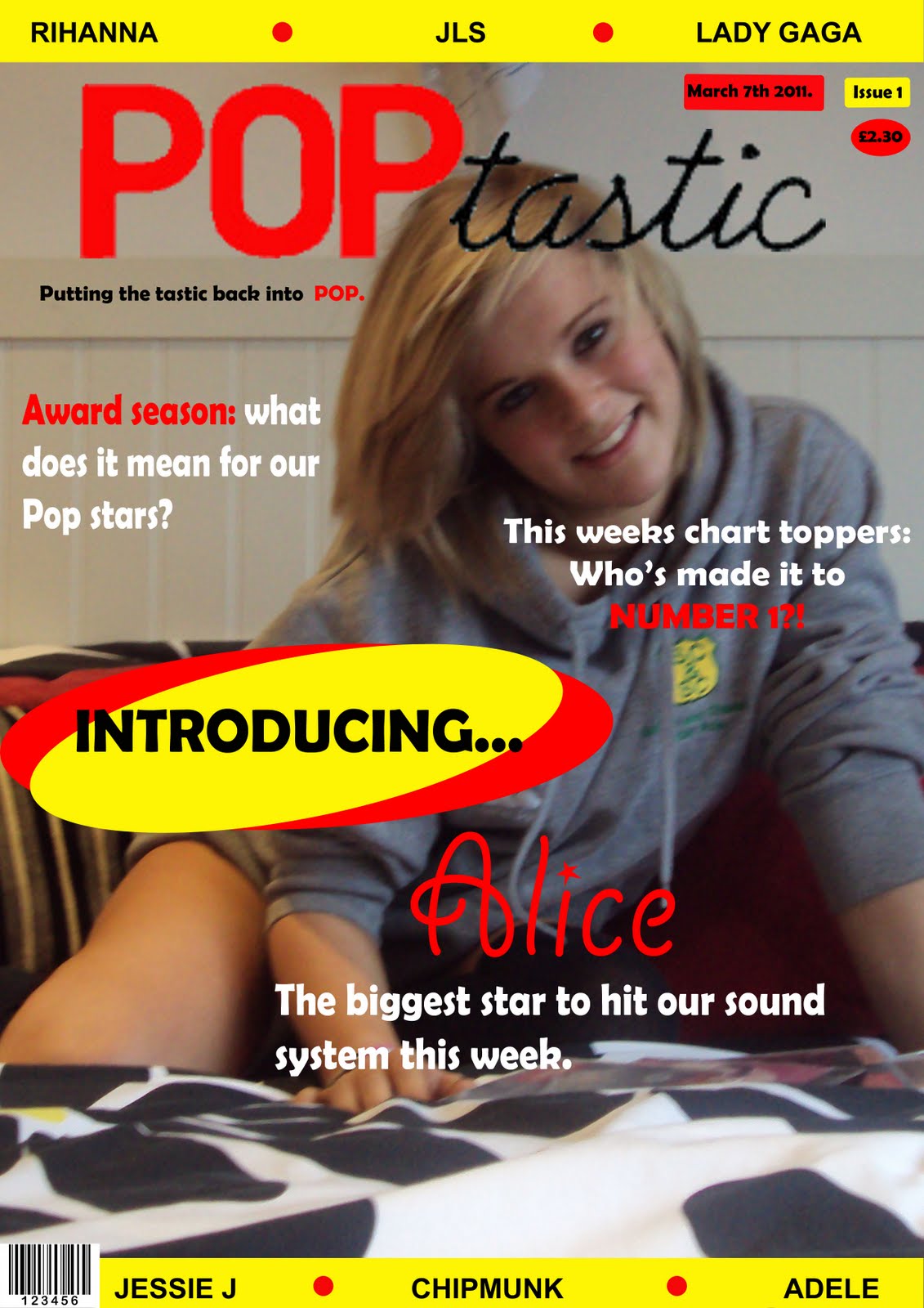
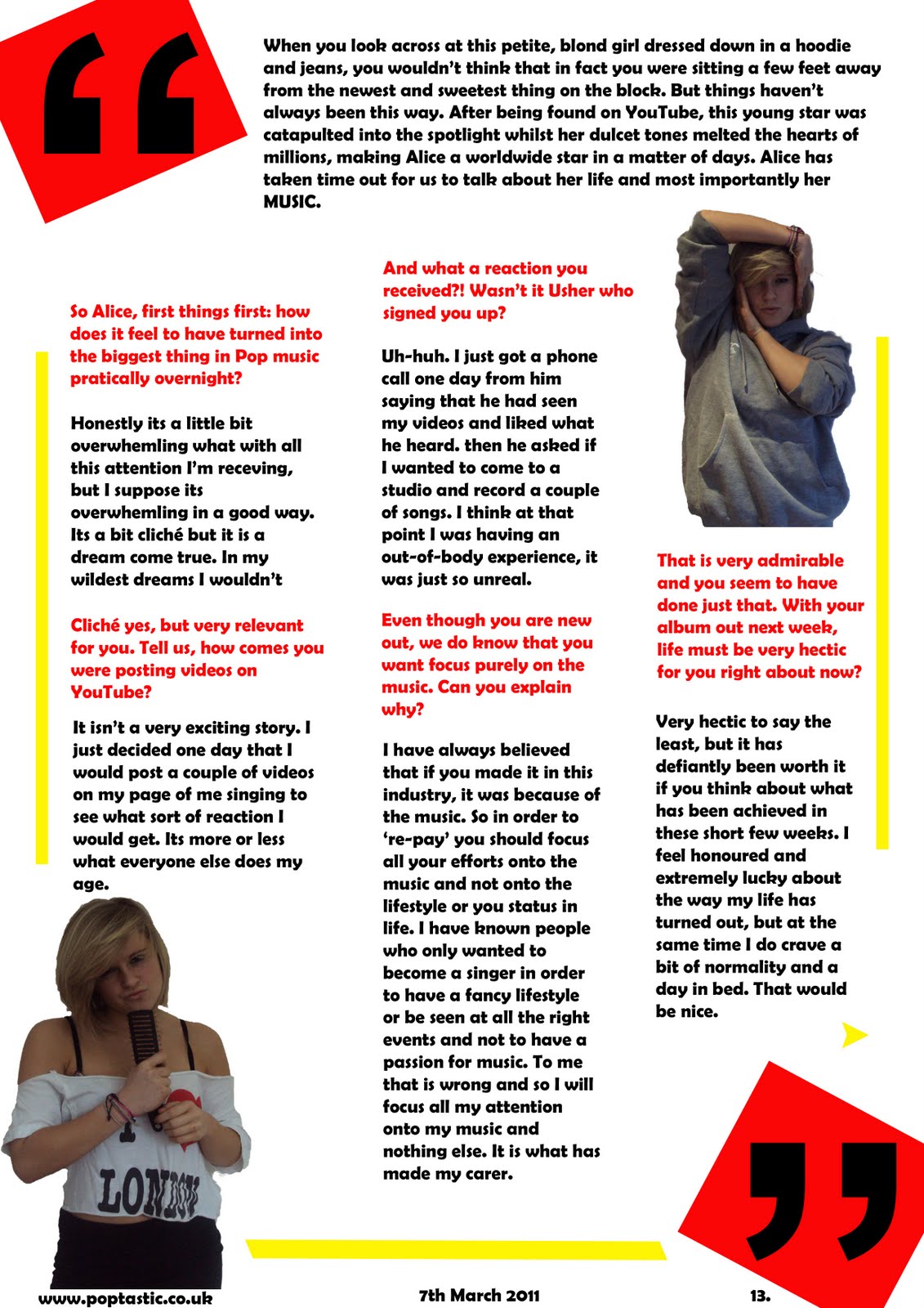
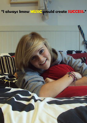
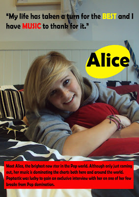
Firstly you can see that I have continued using the same colour scheme and font from my other pieces, in order to create continuity and link them all together.
I've used images that portray 'Alice' as a person who the target audience would be able to relate to easily to, due to the the poses as well as the fact that in every image she is looking at you. This will then draw the reader in, making sure the article is read.
The layout of the DPS has the typical qualities that other magazines have. The first page is just one large photo of 'Alice' with a quote above: a feature that is seen in many magazines regardless of the category. The first page also contains a brief introduction to the article, another common feature, with the red background making it stand out and drawing the eye towards it.
The second page's design is very different to the first page. The most obvious clue is the presence of the overlarge speech marks on a background of red, another common code and convention of magazines. As the speech marks are so big, they automatically draw the readers eyes towards the article, whilst the bright colours enforce this. The page is bordered by the thick yellow lines, which creates space for the text and images as well as adding interest to the article.
I decided to structure the article in the style of an interview; showing both the questions and answers. In order to make this clearer to the reader, I put the questions into red whilst leaving the answers in black.
As most articles of this sort take up more than two pages, I decided to include a small arrow at the end of the text on this page to indicate that the article continues on.
Thursday 24 March 2011
DPS drafts: page 2.
DPS page 2:

This is my starting point for the second page of my DPS. I had decided on one of the images that was going to be used and had started to add some sort of text at the top of the page. I had also added in my giant speech marks, something which is seen in many magazines.
 In my second draft I have added more text to start the article off as well as adding another image at the top, to show even more of 'Alice'. I have also added in the yellow lines which add structure to the piece as well as adding interest.
This is my starting point for the second page of my DPS. I had decided on one of the images that was going to be used and had started to add some sort of text at the top of the page. I had also added in my giant speech marks, something which is seen in many magazines.
Second draft:
In my second draft I have added more text to start the article off as well as adding another image at the top, to show even more of 'Alice'. I have also added in the yellow lines which add structure to the piece as well as adding interest.DPS drafts: page 1.
DPS page 1:
This is my starting point for my DPS. I decided to have a picture as a whole page as that is something that is common in a magazine. I added a quote at the top to give direction to the article, something again which is common in magazines.
Draft 2:
 This is my second draft. I have expanded the quote to make it longer and relate even more to the article on page 2. I have also added a box at the bottom of the page with more text to explain what the article is about. I used a red background for it so it stands out and follows the colour scheme. I have also added 'Alice's' name in a large yellow circle so the reader knows who the article is about, however I don't think it looks that good so I will remove it.
This is my starting point for my DPS. I decided to have a picture as a whole page as that is something that is common in a magazine. I added a quote at the top to give direction to the article, something again which is common in magazines.
Draft 2:
This is my second draft. I have expanded the quote to make it longer and relate even more to the article on page 2. I have also added a box at the bottom of the page with more text to explain what the article is about. I used a red background for it so it stands out and follows the colour scheme. I have also added 'Alice's' name in a large yellow circle so the reader knows who the article is about, however I don't think it looks that good so I will remove it.
Subscribe to:
Posts (Atom)